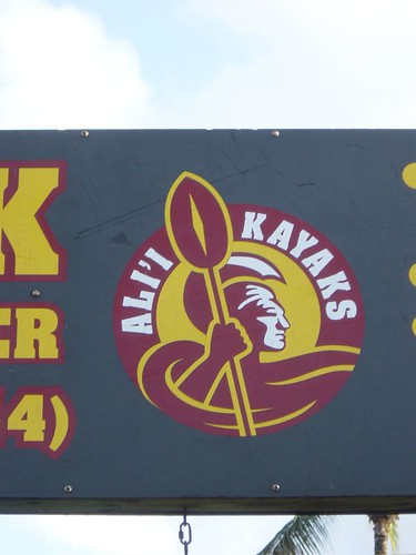
Here are some of the graphics I found. Would any of these be a decent starting point for a soccer club logo?
 I like this one from Maine. Imagine the oars and the kayaks, with a soccer ball in the center. It would have a slight nod to the Mariners' 'Compass Rose' design.
 No real 'Kayaks' design here, but I wanted to post this to show how good red and black look with the name. Those are the colors on the Kitsap County logo, and I support them as the colors for Kitsap Soccer Club, too.
 This design shows a Kayak as a silhouette against a landscape. The soccer club could go this direction and show of some of our county's natural beauty in their logo.
The best for last? This stylized Kayak design really catches the eye. Add in some kind of soccer element and you could have a really nice Kitsap badge.


No comments:
Post a Comment